From Sketch to Screen
The Neon Rush Process — a deep dive into the chaotic brushwork and daring color clashes that defined this album art series.
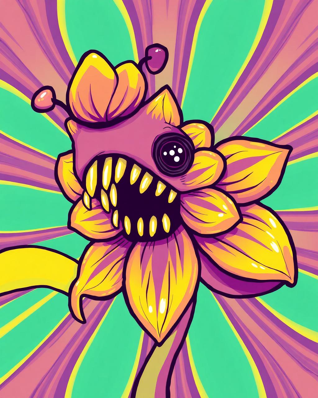
When the brief landed for Neon Rush, I knew restraint was not an option. The band wanted an album cover that felt like a visual riot—something that would stop a scroller dead in their feed and scream listen to this.
"If you're not making something that scares you a little, you're probably making something boring."— My mantra on day one
The Messy Middle
Every project starts with absolute chaos. I filled six pages of my sketchbook with overlapping brush strokes, clashing neon markers, and notes written at 3 a.m. that simply said "MORE PINK." That energy is what eventually translated into the final pieces.
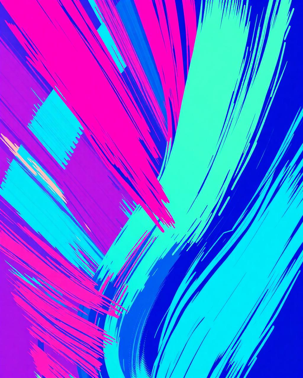
The challenge was balancing chaos with readability. Too much color, and the typography disappears. Too little, and the cover loses its bite. After countless iterations, I landed on a technique I call "anchor clashing"—using one dominant neon as a backdrop while letting the others dance on top.
Typography That Screams
The custom type was built from scratch using a modified Bungee skeleton, stretched and distorted to feel like it's vibrating. I wanted the lettering to feel slightly uncomfortable—like it might jump off the sleeve at any moment.
Rough Sketches
100+ thumbnail concepts exploring composition and color temperature.
Digital Refinement
Vector cleanup in Illustrator, followed by textured brush work in Procreate.
Color Clash Testing
Running 20+ palette variations through a custom contrast matrix.
Final Polish
Texture overlays, chromatic aberration, and print-proofing for vinyl.
What I Learned
This project reinforced something I've always believed: color is a feeling, not a decoration. When you treat it like the main character, everything else falls into place. The Neon Rush series got picked up by three blogs and led to two more album commissions—proof that leaning into maximalism pays off.
Want to discuss a project like this?
Let's Talk